CASE STUDY
HOTEL BOOKING UI
01
HOTEL CALM
Translating the Hotel Atmosphere into UI
Goal
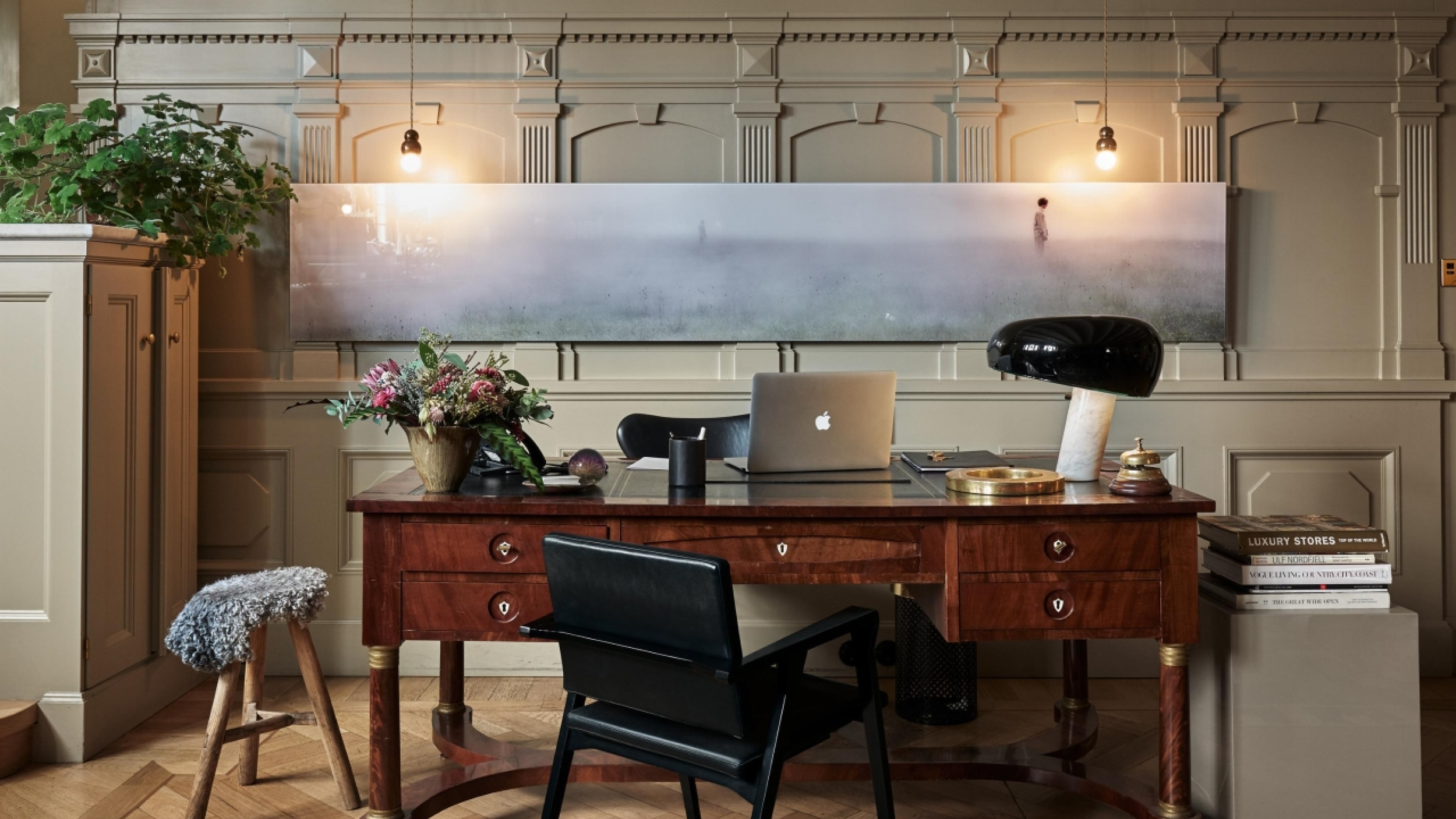
(A) The hotel - the customer
(B) User flow
Goal of this project was to design an intuitive hotel booking app that translates the atmosphere and experience of the hotel into a digital product. The app focuses on creating a smooth and effortless booking flow while clearly presenting the hotel’s rooms, service and offers.
Part
(A)
Expectations & challenges
The hotel attracts a diverse and design conscious audience, including business travelers who appreciate a modern and stylish environment, as well as young professionals and creatives drawn to its vibrant atmosphere. Guests are typically looking for a hotel that combines contemporary design, comfort and a calm yet social experience.
About
Balancing strong visual appeal with clear functionality was a key challenge. Users expect a visually engaging experience without compromising usability. Another challenge was incorporating personalized features, such as room preferences and local recommendations, while keeping the booking flow fast and intuitive. The app needed to guide users smoothly through each step of the booking process and provide clear, immediate confirmation to create a sense of trust and efficiency.
Part
(B)
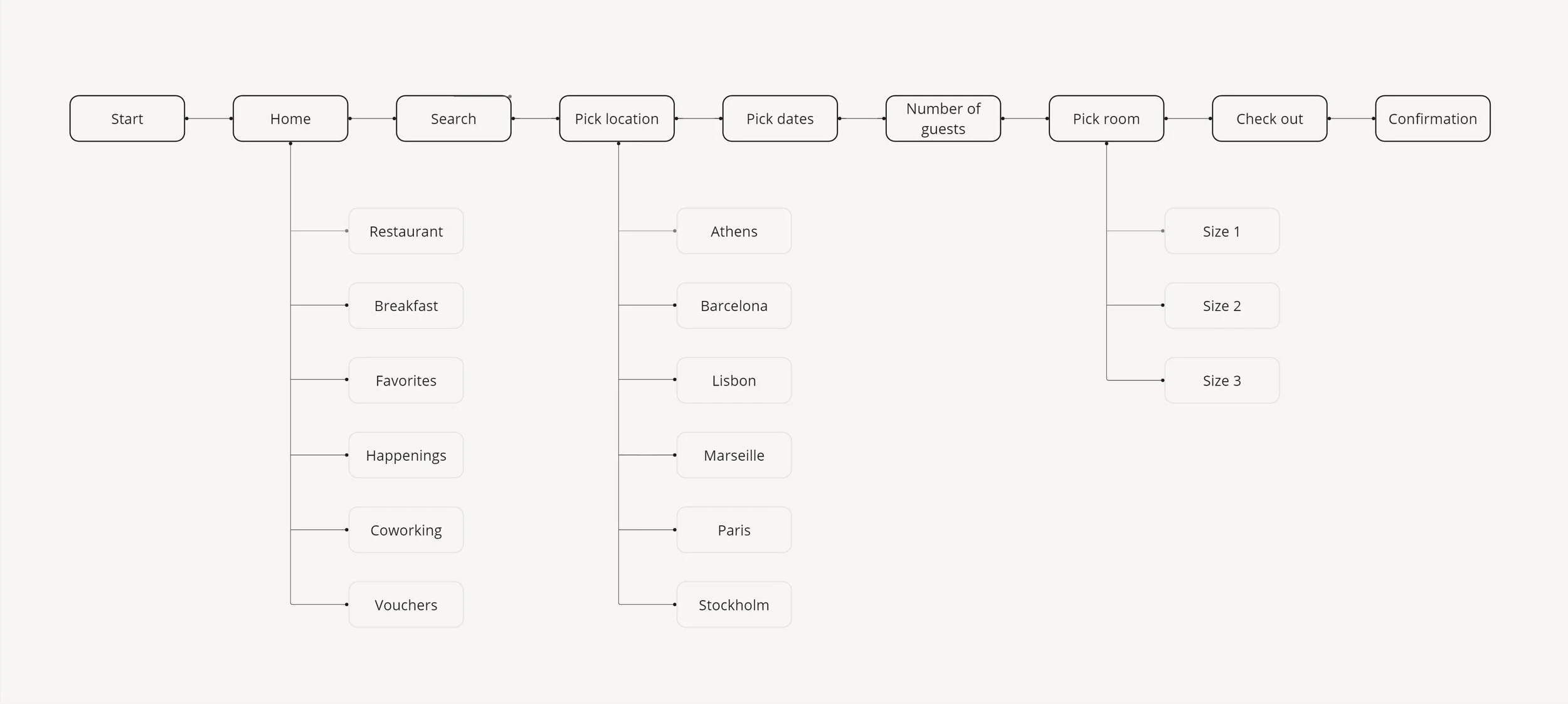
The theme
User flow
About
The user flow in this case is designed to support the prototype presentation. To maintain clarity and focus, only the necessary steps are included, highlighting the most important interactions within the booking process.
02
(A) Colour
(B) Typography
(C) Interaction
(D) Photos
Part
(A)
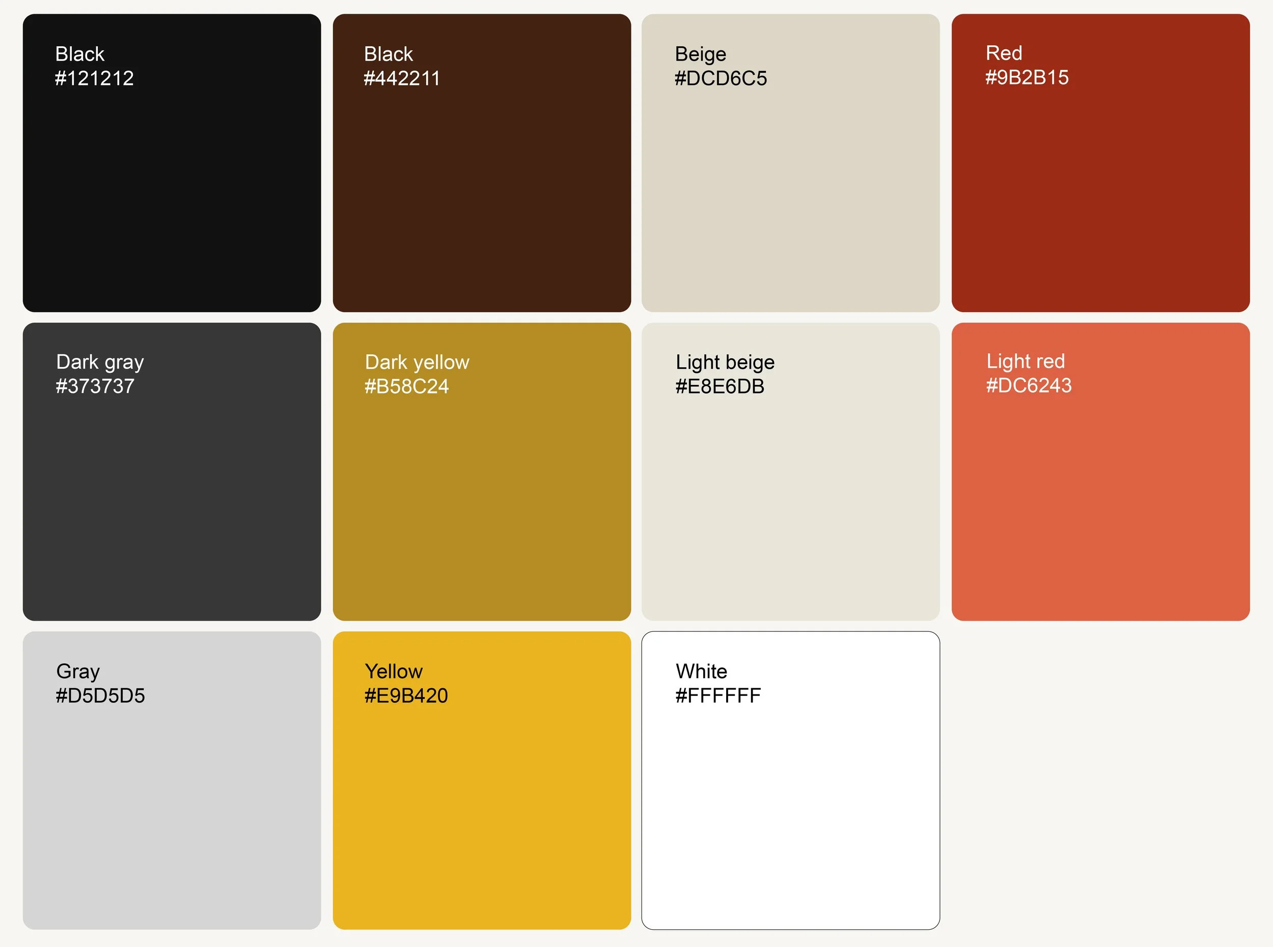
The theme
Colour
About
To enhance the imagery, a warm and muted colour palette was chosen to create a cozy and inviting atmosphere. The colours are inspired by the distinctive palette of Field Notes notebooks, supporting a tactile, editorial feel while allowing the images to remain the primary focus.
Part
(B)
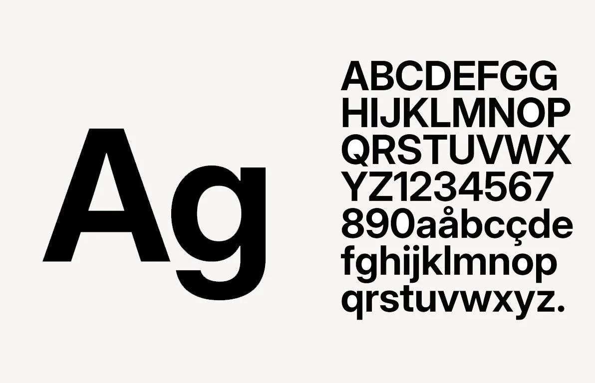
The theme
Typography
About
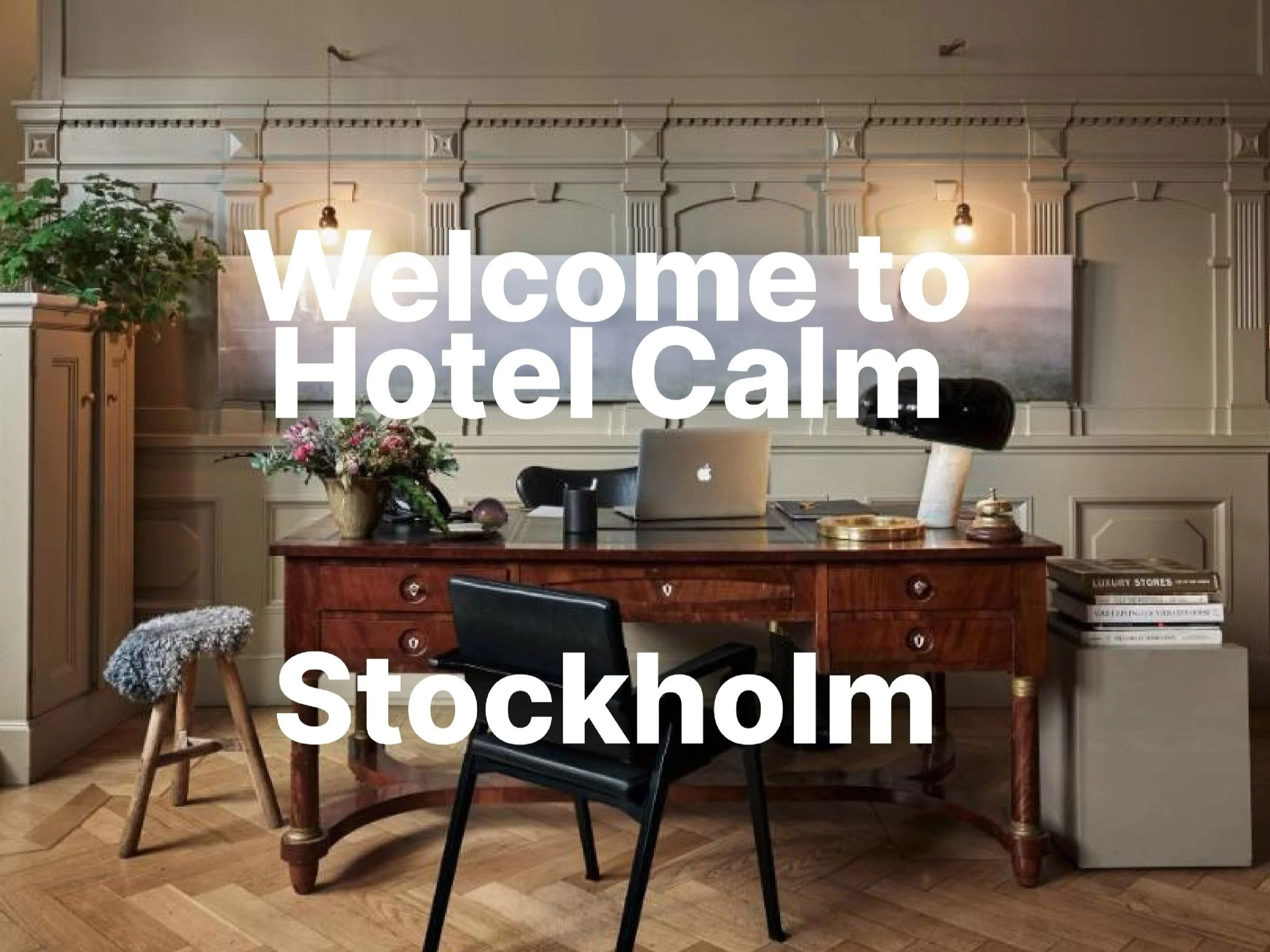
The typography is Inter, it is minimalistic and works well in a bold feature. The text is centered and often directly on the images.
Part
(C)
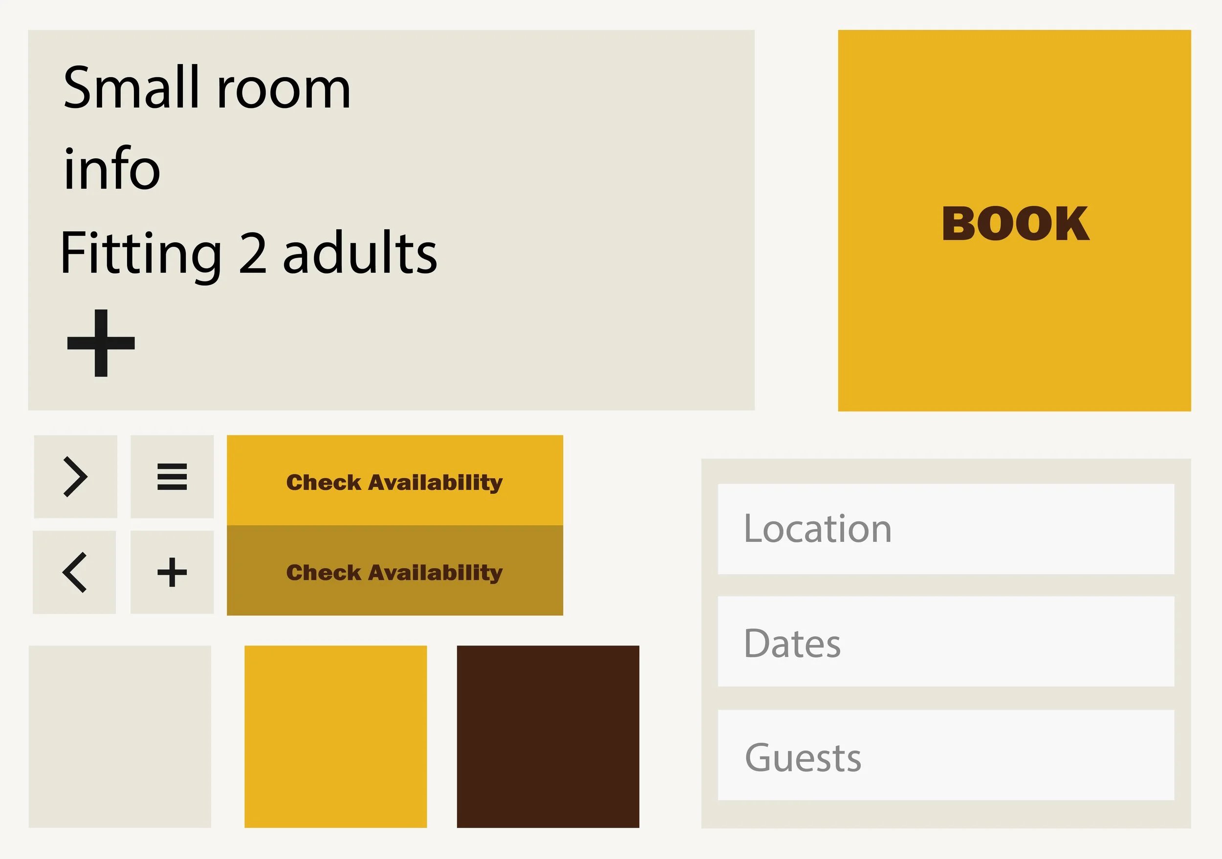
The theme
Interaction
About
Inter was chosen for it’s clean and minimalistic character, allowing the typography to remain clear and readable while supporting bold visual elements. The typography is often centered and placed directly on imagery, creating a strong visual connection between text and image without compromising clarity.
Part
(D)
The theme
Photos
About
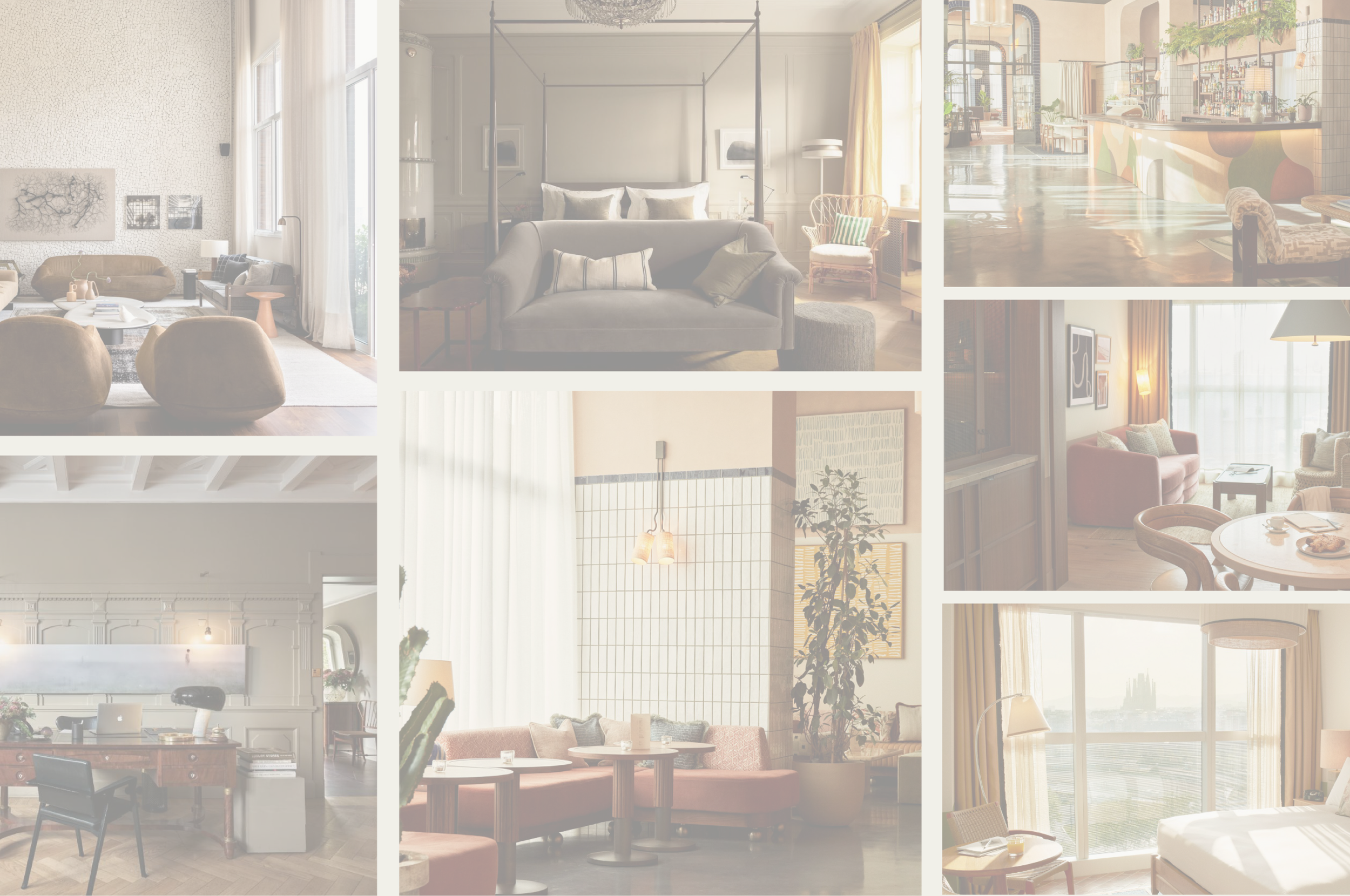
Photography plays a key role in shaping the overall tone of the app. A warm colour treatment was chosen to create an inviting and calm atmosphere that supports the hotel experience. The images are shot from a front-facing perspective with centered composition, creating a sense of balance and calm while allowing the visuals to inspire users.

03
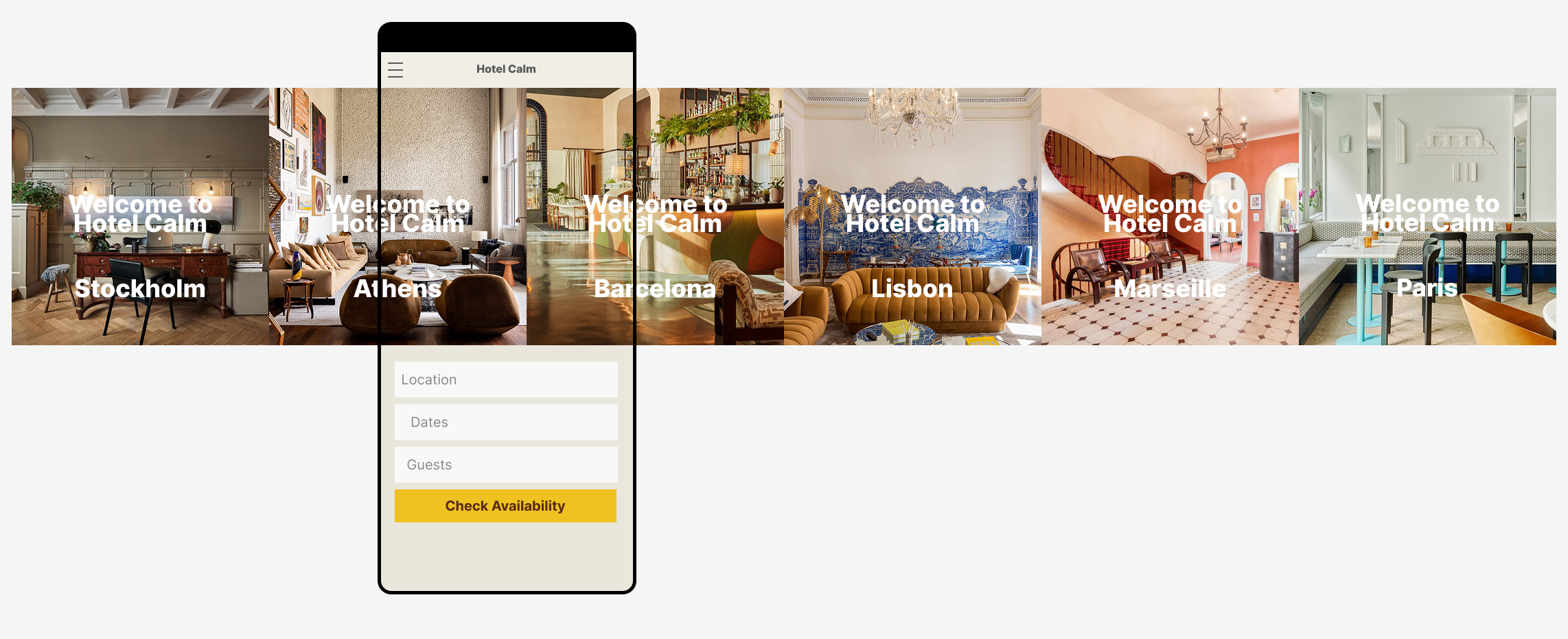
(A) Start screen
(B) Search
(C) Location
(D) Calendar
(E) Confirmation
Part
(A)
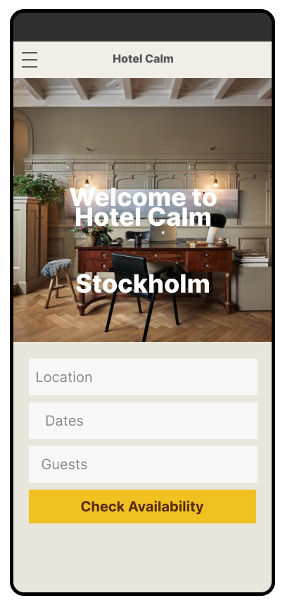
The theme
Start screen
About
The start screen introduces the user to different hotel locations through a horizontal image carousel. This interaction allows users to quickly swipe between locations, creating an intuitive and engaging entry point to the booking experience.
Part
(B)
The theme
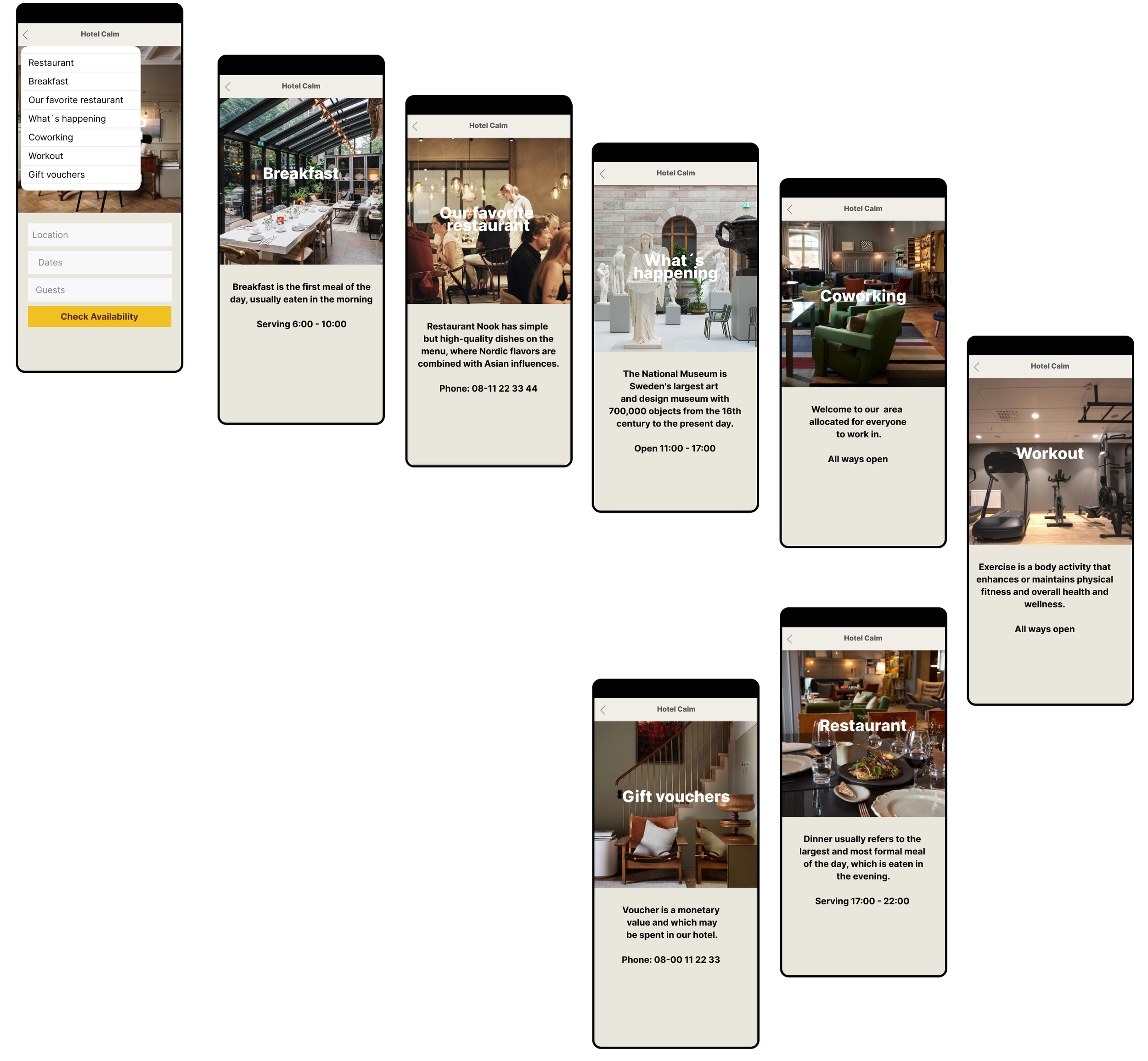
Search
About
The search function guides users to a drop-down menu with several filtering options, allowing them to quickly refine their selection. Navigation is supported by a back arrow , ensuring users can easily return to the previous screen and maintain a smooth and intuitive flow.
Part
(C)
The theme
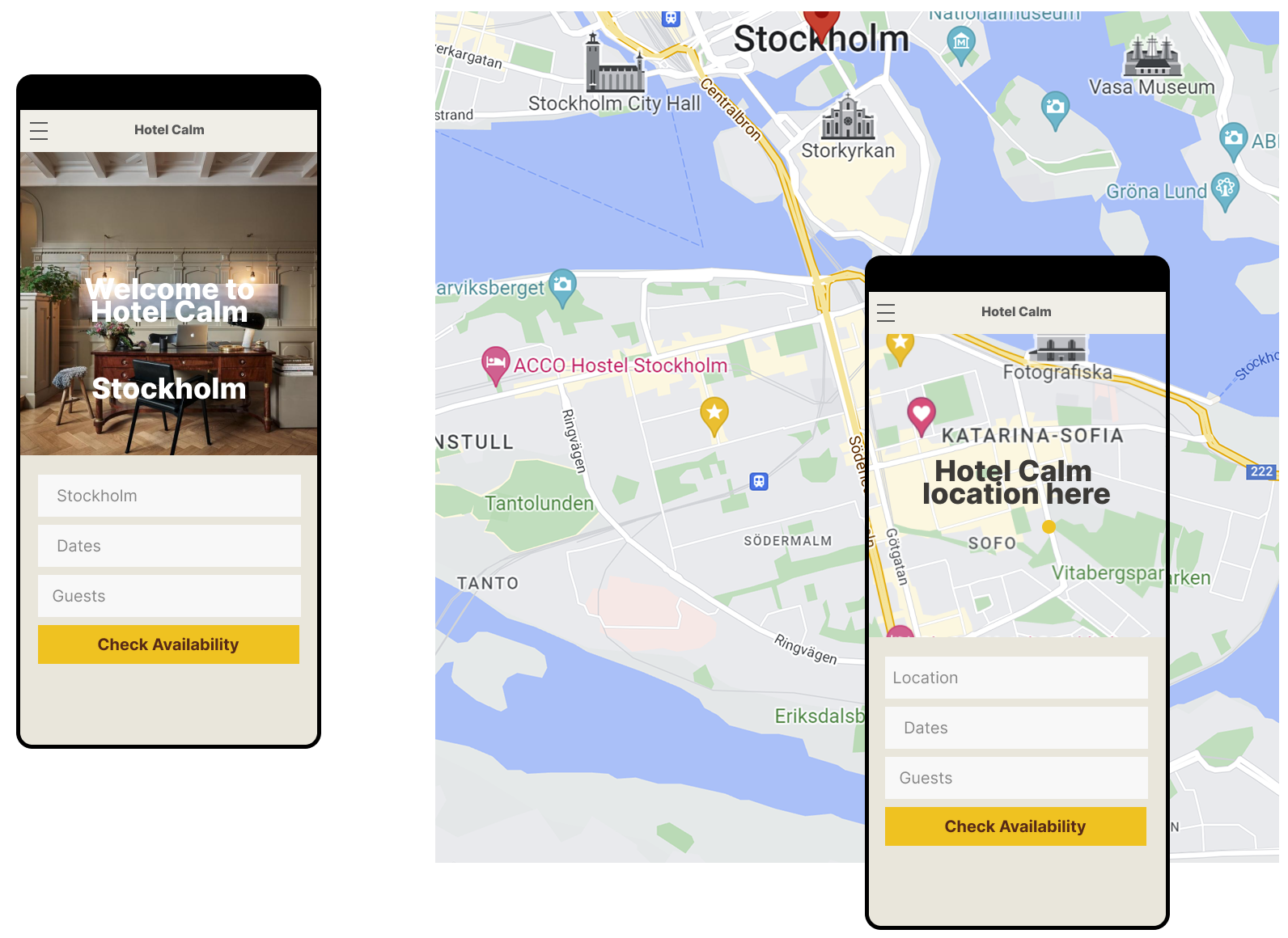
Location
About
When the user selects a location, the interface transitions to a scrollable map, providing a clear and interactive view of the hotel’s position. This allows users to understand the surroundings at a glance and supports confident decision making.
Part
(D)
The theme
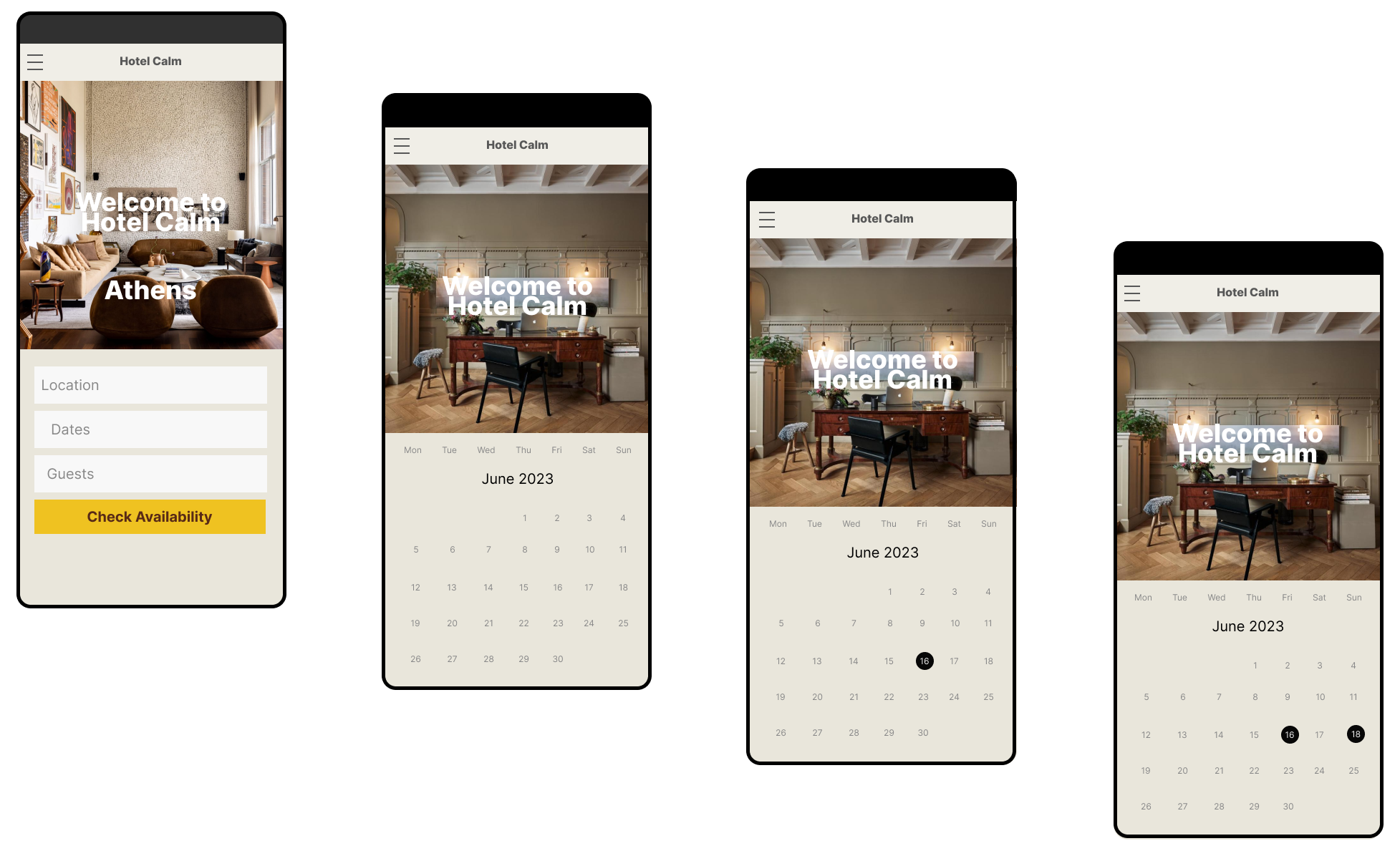
Calendar
About
The calendar feature allows users to easily select a start and end date for their stay. It’s clear and simple design ensures the selection process is intuitive, reducing friction and supporting a smooth booking experience.
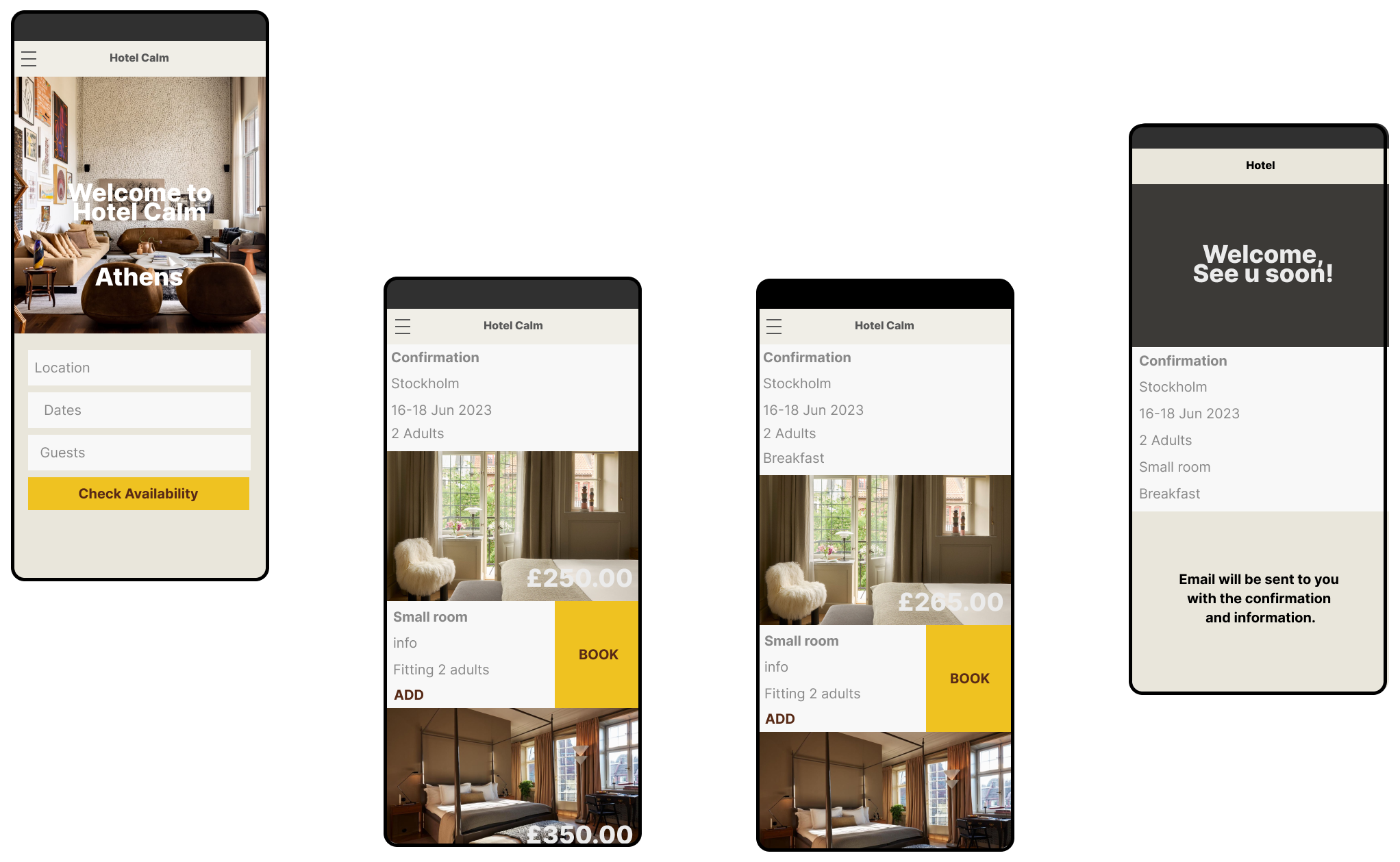
Part
(E)
The theme
Confirmation
About
The confirmation screen provides users with clear feedback throughout the booking process. Selections are reflected in real time on the confirmation screen, and once the booking is complete, the screen serves as the final overview of the reservation. This ensures users feel informed and confident at every step.
Part
(F)
The theme
Prototype
About
This prototype showcases the hotel experience through carefully curated imagery and a cohesive visual ambience. The app guides users smoothly through the booking process, while the confirmation screen provides clarity and control, ensuring confidence at every step. See the prototype here.