BUILD
HOTEL BOOKING UX

Balancing strong visual with UX
01
HOTEL CALM
Goal
(A) The hotel - the customer
(B) Research
(C) Affinity diagram
(D) Customer journey
Goal of this project was to design an intuitive hotel booking app that translates the atmosphere and experience of the hotel into a digital product. The app focuses on creating a smooth and effortless booking flow while clearly presenting the hotel’s rooms, service and offers.
Part
(A)
Expectations & challenges
The hotel attracts a diverse and design conscious audience, including business travelers who appreciate a modern and stylish environment, as well as young professionals and creatives drawn to its vibrant atmosphere. Guests are typically looking for a hotel that combines contemporary design, comfort and a calm yet social experience.
About
Balancing strong visual appeal with clear functionality was a key challenge. Users expect a visually engaging experience without compromising usability. Another challenge was incorporating personalized features, such as room preferences and local recommendations, while keeping the booking flow fast and intuitive. The app needed to guide users smoothly through each step of the booking process and provide clear, immediate confirmation to create a sense of trust and efficiency.

Part
(B)
The theme
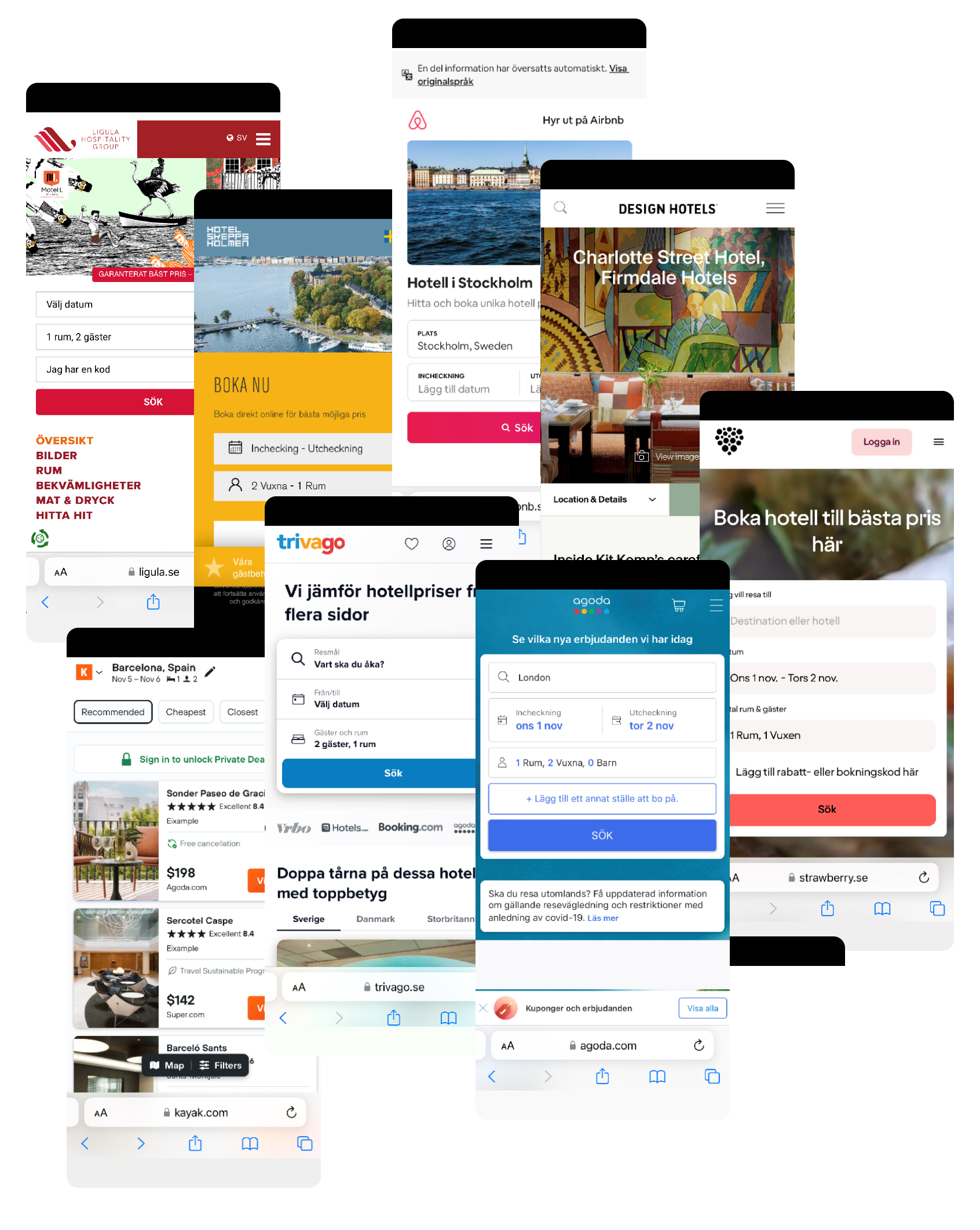
Research
About
Through usability tests and competitor benchmarking, we found that hotel bookings are largely driven by preset dates and destinations. Most booking apps handle this with a direct availability check, which works well, but the calendar experience varies greatly, affecting overall easy to use.
While preset destinations and dates are standard, visuals play a key role in setting the mood and guiding users. Most apps rely on generic imagery, resulting in a bland and uninviting interface. At the same time, providing clear and objective information is crucial for users to make decisions quickly.
Our research shows that with simple design enhancements, more engaging visuals and thoughtful presentation, there’s an opportunity to stand out from competitors, increase user interest and create a more inviting booking experience.
Part
(C)
The theme
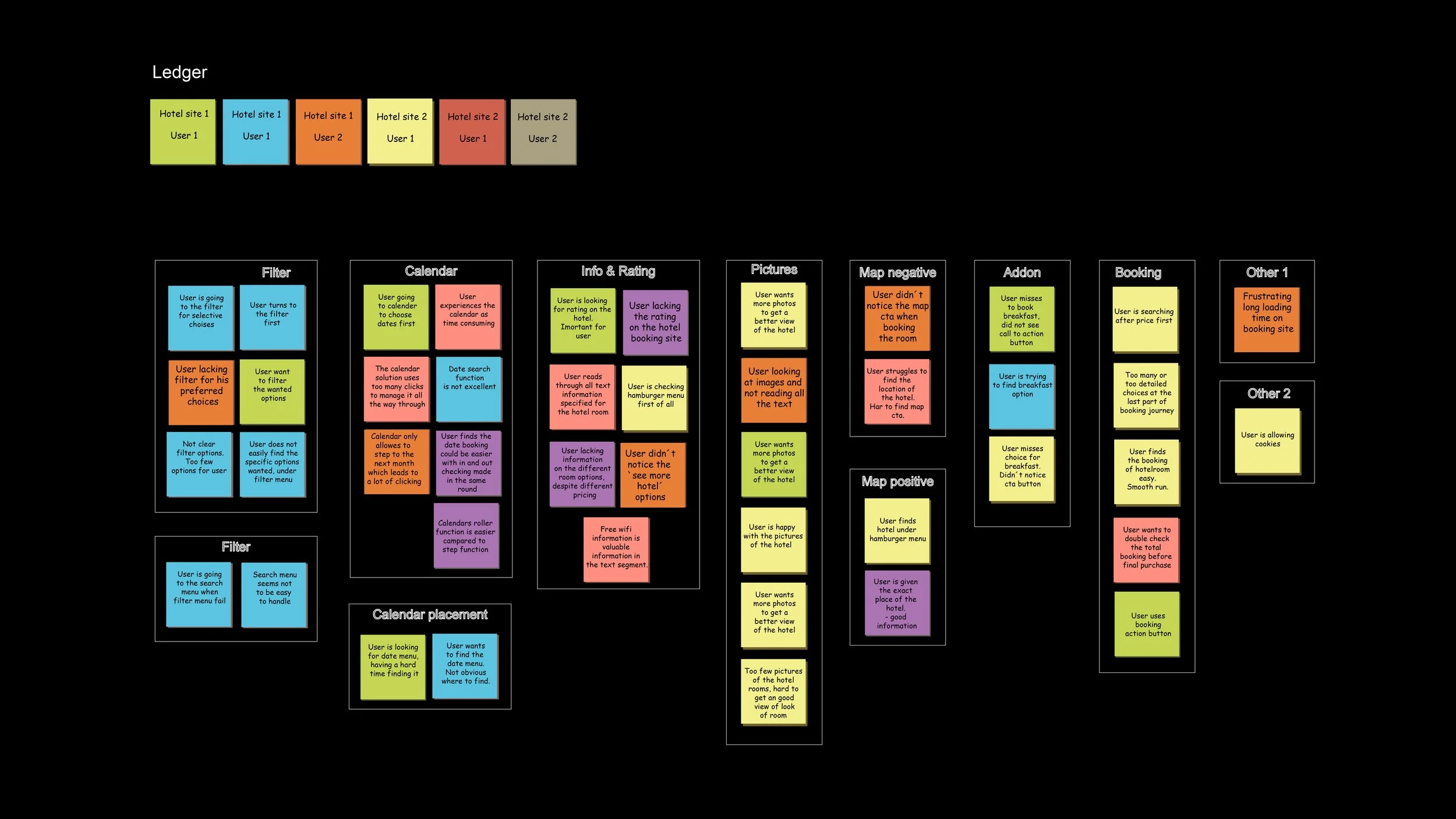
Affinity diagram
About
By organizing qualitative feedback into thematic clusters, including filters, calendar, information hierarchy, ratings, imagery and booking we identified patterns that revealed both usability issues and opportunities for improvement.
The analysis highlighted the importance of clear pricing and essential information to reduce friction and support fast decision making.
Visual presentation emerged as a key emotional driver, where hotel imagery and location context, supported by maps, help users orient themselves and build confidence.
Add-ons should be visible and easy to access without disturbing the booking flow.
These insights guided design priorities and helped shape a more intuitive, efficient and visually engaging booking experience.
Part
(D)
The theme
Customer journey
About
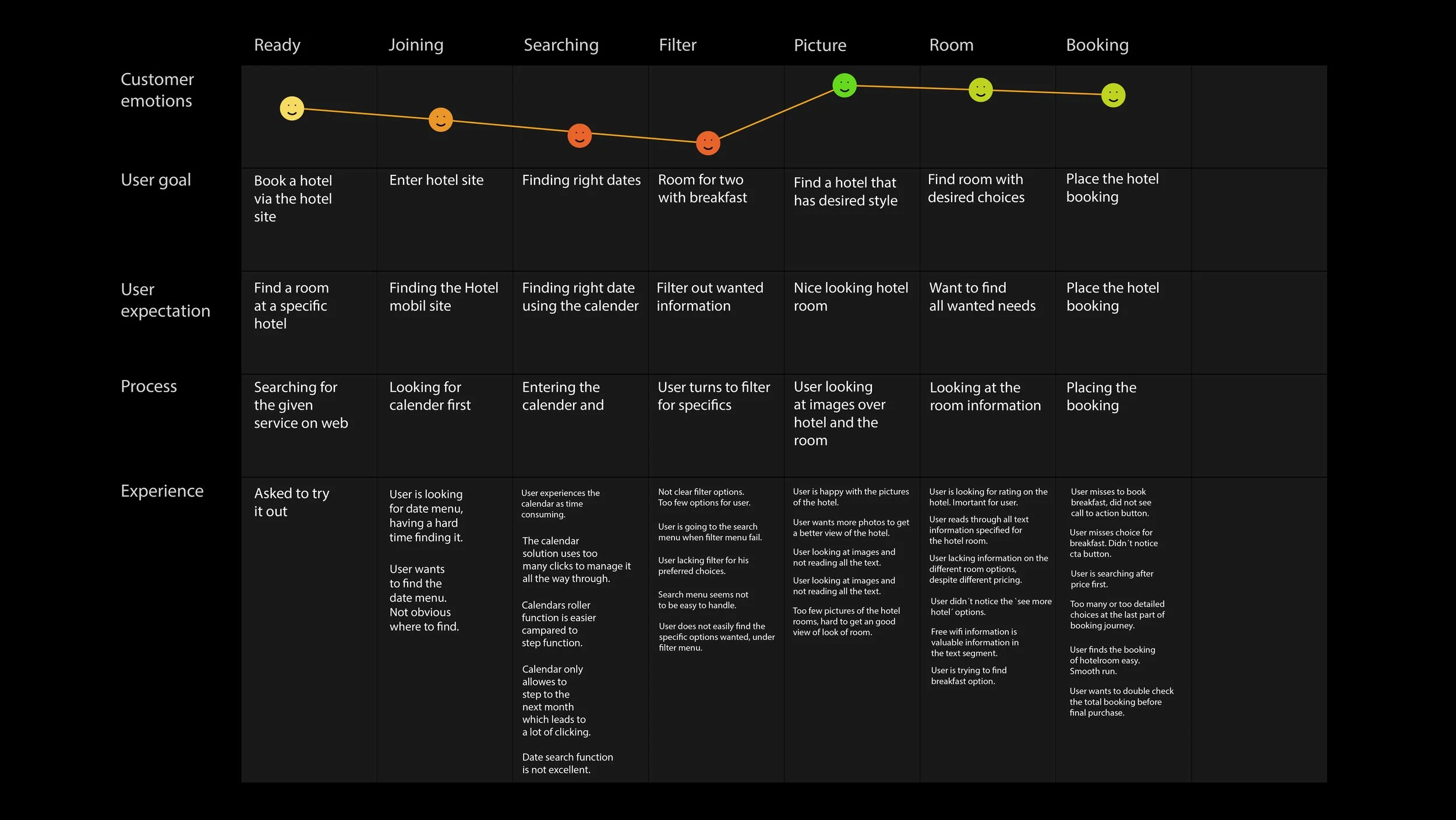
The diagram illustrates the user’s experience from initial entry point to completing a hotel room booking. It highlights key touch points such as search, filters, imagery, room selection and booking with the goal of identifying pain points and opportunities to provide the overall interaction.
The journey shows a generally positive experience with minor drops during search and filtering, where users may feel slightly uncertain or slowed down. Engagement and confidence increase when users encounter strong visual content, as images play key role in setting expectations and creating the right mood. Clarity around pricing and included services further strengthens user confidence, leading to a positive emotional peak at booking completion.
The insights emphasize the importance of smooth interactions throughout the flow, supported by high quality imagery and clear information to ensure a frictionless and reassuring booking experience.
02
(A) Flow diagram
(B) Wirefrmes
(C) App prototype
Part
(A)
The theme
Flow diagram
About
This flow diagram visualizes the user journey across the entire booking process, from app entry to confirmation. By breaking the experience into clear, sequential steps, the diagram supports an intuitive interaction model, highlights dependencies between actions and helps ensure a smooth and predictable booking flow.
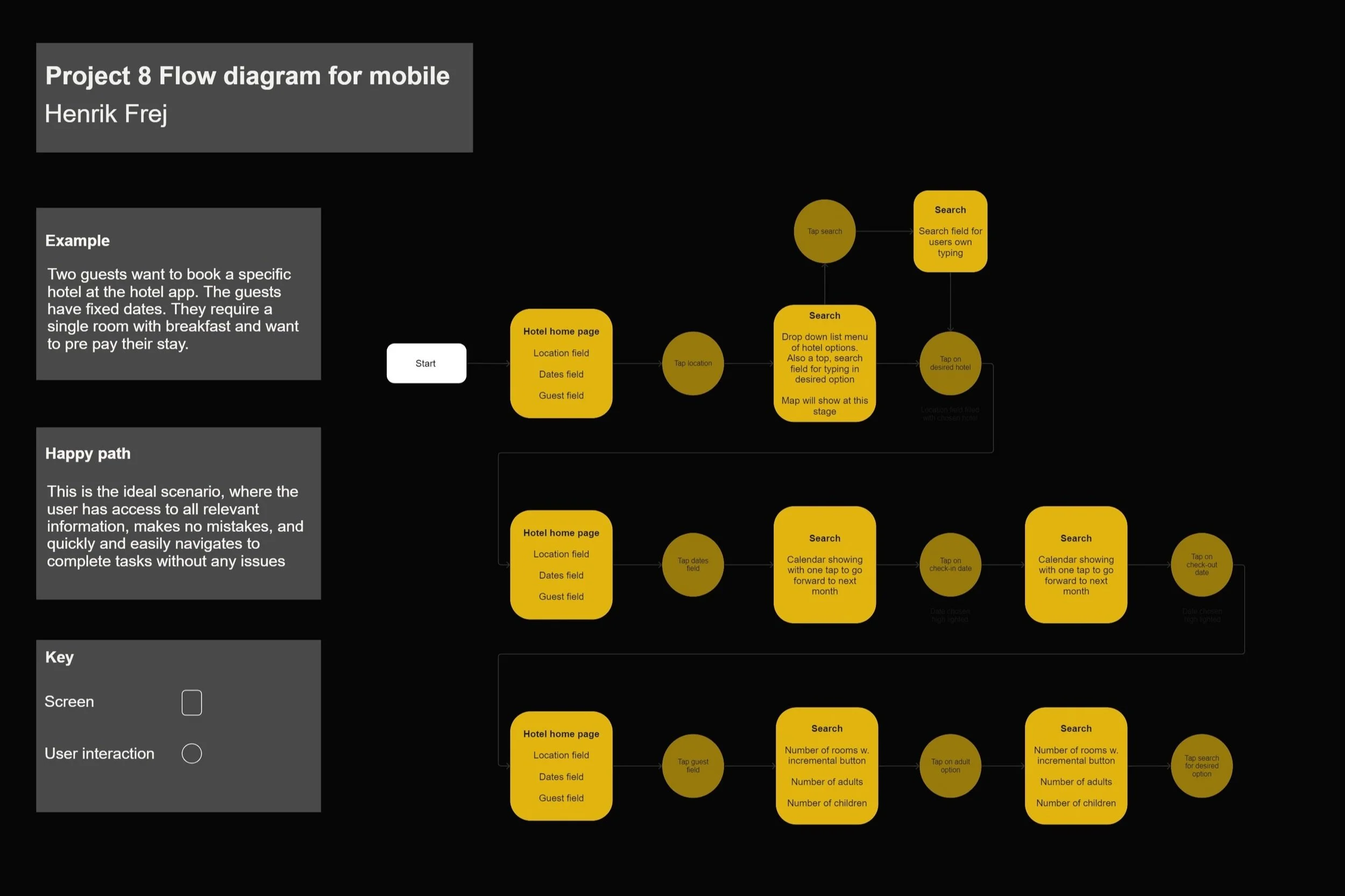
The first screen prioritizes venue, dates and number of guests, reflecting the user’s primary decision drivers at the start of the booking flow. A clear and easy to read calendar supports fast date decision while single tap interactions keep the process efficient and friction free.
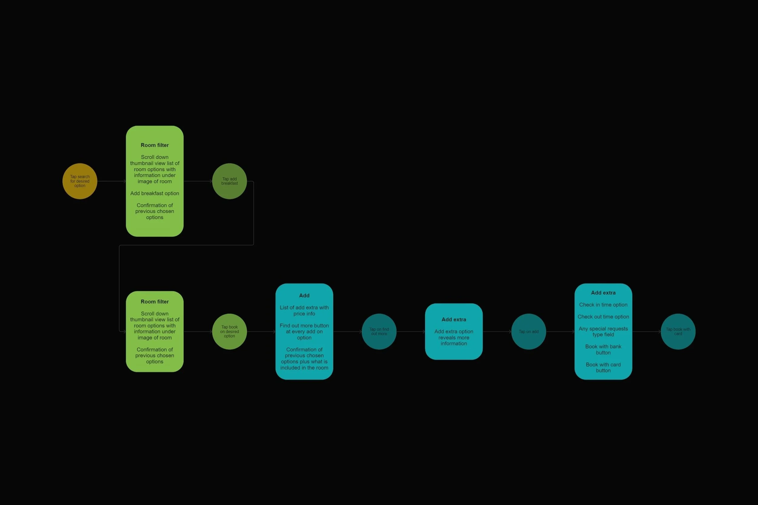
The room filter stage is designed to support fast decision making by reducing choice overload. Optional add-ons are presented contextually and follow the same one tap interaction model, allowing users to customize their stay without adding complexity or breaking the booking flow.
The third stage focusing on entering payment details, where smart autofill for previously known information reduces effort and speeds up completion. The final stage presents a clear confirmation view with all relevant booking details, reinforcing trust and providing reassurance that the reservation has been successfully completed.
Part
(B)
The theme
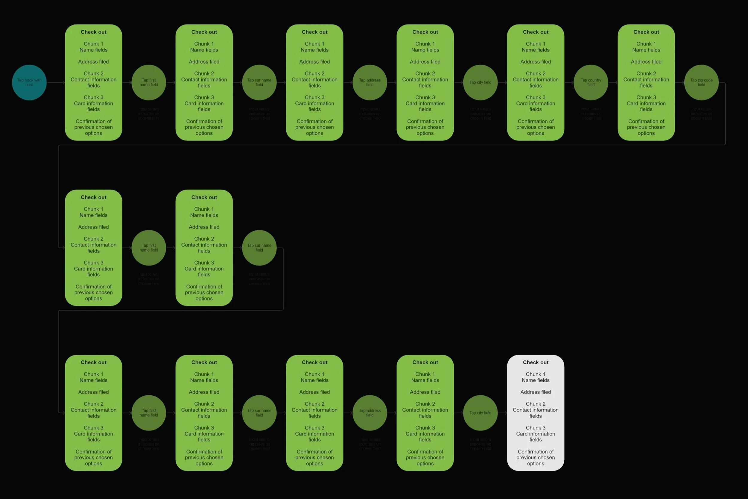
Wireframes
About
The step wireframes serve as a blueprint of the app, visualizing key screens and core functionality. They outline the overall structure of the experience, including the Home Screen, search interface, room selection, booking form and confirmation screen.
The wireframes focus on user friendly interactions, informed by multiple interactions and careful prioritization of features. Each screen was designed with clear hierarchy, logical order and intentional placement of elements of support an intuitive and efficient booking flow.
