REDESIGN
EVCONNECT APP

Improving clarity, engagement and thrust in the platform
OUR VISION IS PROBLEM FREE CHARGING FOR EVERYONE
This UX case study explores how the EV Connect app could be improved to better communicate its offering and enhance the overall user experience. Together with a colleague, I evaluated the existing app and identified five key areas for improvement, focusing on clarity, information structure, engagement and visual communication.
The proposed solution include more inviting visual content, a clearer presentation of the company's expertise, illustrative and interactive elements to support understanding and the introduction of an Ai-powered chat feature to guide users through the platform.
5
Improvements to clarify information, enhance engagement and elevation the visual experience
1.
2.
3.
4.
5.
More inviting visual experience
Illustrative content for better understanding
Clearer company positioning
Interactive steps to guide users
Ai-powered chat support


Style Guide
The color green not only represents nature and health, but also other important areas. In traffic, the color green signals drivers to drive forward, safety and permission. In addition, green is often used to indicate environmentally friendly and sustainable options, especially in the growing sector of electric vehicles and sustainable energy.
Primary & Secondary Colors


Typography


Wireframes
These are the wireframes of Ev connect application


Detailed view
Illustrative features
Illustrative features clarify the meaning of each survey question, while a top progress bar indicates completion status, helping users track progress and better understand the process.

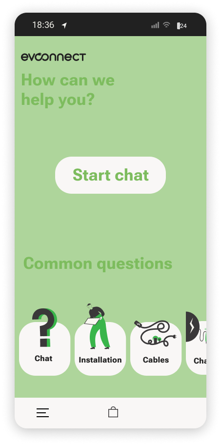
Support chat
An Ai-powered chat helps users get quick support. A central CTA button to start the chat, while a horizontal carousel at the bottom ensures fast access to key features.

Screen preview
Below is the five functions added to the site that will improve and clarify the user experience
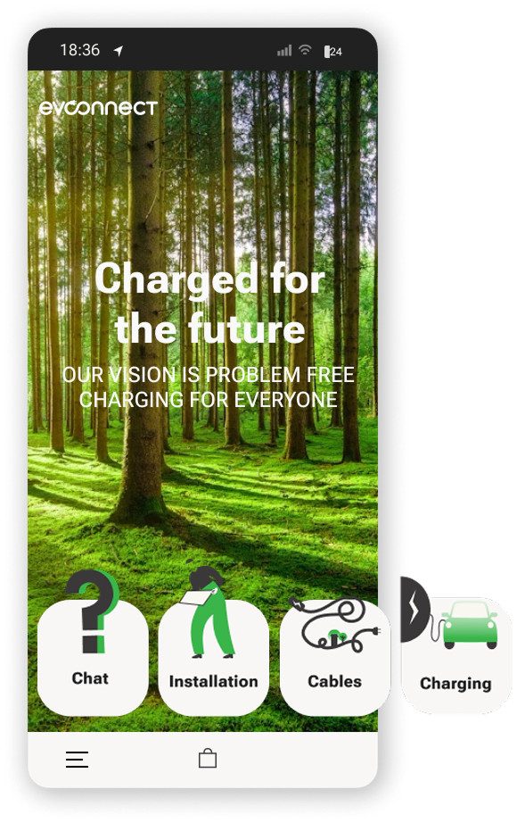
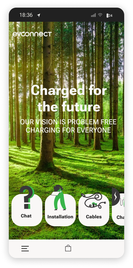
Landing screen
The landing screen welcomes user with a nature inspired visual concept that reflects sustainability and green energy. A central value statement introduces the brand vision. A horizontal carousel at the bottom of the screen offers quick access to key features.
Company presentation
By separating branding and content into two distinct sections, the design improves readability and helps users quickly distinguish between identity and information.

Interactive features
An illustrative search experience that helps users identify the correct charging cable for their vehicle. The centrally placed search field, supported by clear iconography and visual cues, guides users to enter their license plate number. Compatible options are presented instantly, while a horizontal carousel ensures quick access to key features.

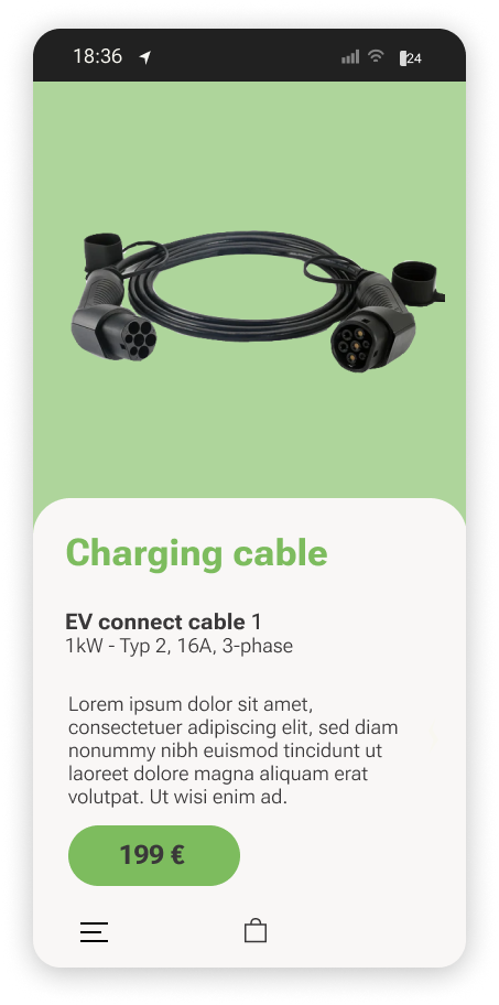
Selection stage
A vertically scrollable product overview presenting cables as cards with clear imagery, essential information and pricing to support quick comparison and selection.

The selected product is displayed on a green background, while a white vertically scrollable panel presents details product information including name, price and key specifications.